
Effective Design: Creating Presentations
Overview |
Designing effective presentations is not always an easy, or intuitive task, particularly when relying on pre-packaged software design templates as a starting point. This document serves to introduce several presentation design principles that you may consider when creating your next presentation, or revising an old one.
MSU also offers an institutionally branded PowerPoint template that can be obtained here.
Effective Design: Creating Presentations |
Principle #1: Keep it Simple
The idea of simplicity is a key concept for making effective presentations. Too much clutter, or information (images, text, charts, etc.) can distract viewers from the purpose of your slides. Garr Reynolds (2010) relates the principle of simplicity to greater clarity and consequence in presentations. Similarly, the aim of simple design is to yield the maximum effect with minimal means.
Try to avoid:
- Too much font, too many bullets, or ‘Text Walls’ on a single slide.
- Your slides should not serve as a prompter for your lectures, but rather as a guide to you and your students about the topics and ideas being addressed.
- If you are a PowerPoint user and prefer to make your presentations and notes available to your students, use the PowerPoint Notes section. This will allow the information to be transmitted to your students, but not interrupt your presentation.
- Too many images or charts on a single slide.
- Conflicting images that overlap can cause a cluttered feel to your powerpoints.
- Background images and designs can conflict with your visual and text content.
- Try to utilize photographs versus clipart.
Examples:
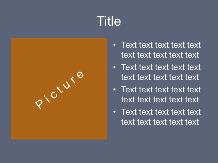

This is a document This is a slide
Principle #2: Make Text Legible and Consistent
Though powerpoint offers a large variety of fonts to choose from it is recommended to use Sans Serif fonts for on screen presentations (Tisdale, 2005; Reynolds, 2010; Pugsley, 2011). “The sans serif font (literally, “without feet”) projects better on a large screen than the serif font.” (Tisdale,2005, p.116). Using the same fonts family throughout the whole presentation will make the presentation slides more consistent. The minimum font size should be at least 32-points for titles, and 18-point font for the body (Tisdale, 2005). A list of sans serif fonts can be viewed here.
Try to avoid:
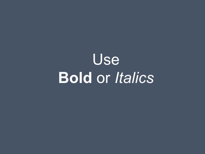
- Underlining for emphasis, as it cuts off the lower part of letter (g-g, p-p), instead use bold and italics (Kosslyn, 2011)
- Using uppercase, italics, or bold for more than three or four words in a line (Kosslyn, 2011)
- Using a distracting background, as it may lure the eye away from information-bearing lines (Kosslyn, 2011)
Examples:


Principle #3: Use colour to emphasize and highlight
Studies show that color usage can increase interest and improve learning comprehension and retention (Reynolds, 2010), hence it is important to use the right colors for slides. Effective slides need a sharp contrast between the slide background and the text or illustration (Tisdale, 2005). A simple way to implement contrast is to reference the classic color wheel, which is divided into two halfs: warm colors and cool colors (Weissman, 2011). Use cool colours (such as blue and green) for background and warm colours (such as orange and red) for objects or text in the foreground. If the slideshow will be presented in a dark room, use a dark background (dark green, dark blue) with light text, if the room has an abundance of light, then use a light background with dark text (also recommended for virtual presentations). Use a more salient color for the title than for the text, which will direct students’ (audiences’) attention accordingly.
Try to avoid
- Using Red/Blue and Red/Green in adjacent regions, as they are difficult to focus on at the same time, whereas it is impossible for many color-blind people to distinguish between red and green (Kosslyn,2011).
- Avoid using more than four colors for the text (Kosslyn,2011)
Examples:


Avoid this combination of colors Use this combination of colors
Principle #4: Include active links
As one type of slide enhancement, Trisdale mentions hyperlinks as a means of creating dynamic presentations (Tisdale, 2005). Use hyperlinks not only to navigate through the slides but also to go directly to the Internet pages you feature. When designing online presentations you can also include active hyperlinks so students (audiences) can have immediate access to websites you are referencing. They can immediately open and view the links you provide on their own device.
Try to avoid
- Broken, outdated, or incorrect links.
Principle #5: Transitions and Animations
“Ideally, presenters should move smoothly and consistently between the different slides in a presentation so that the transition itself doesn’t become a distraction for an audience” (Tisdale, 2005, p. 125). There shouldn’t be more than two or three types of transition effects throughout the whole presentation and not all slides must have transition effects between them. Animations should be subtle and professional, for example “Wipe Left-to-Right” can be a good transition for a bullet point.
Try to avoid:
- Using slow transitions, particularly fade-ins and fade-outs. (i.e., longer than 5 seconds)
Principle #6: Visual Theme
Use the same visual template throughout your whole presentation. Although PowerPoint has pre-created and aesthetically consistent templates, it is often suggested that you create your own templates. After you create your own theme you can save it as a Design template(.pot) and use it later for your presentations.
If you are interested in discovering more effective ways to create templates using PowerPoint, please view the following resources:
- The Secret to Creating your Own PowerPoint Template
- How to Design Custom PowerPoint Templates for e-Learning
Principle #7: Charts/Graphs
“Audience members will better understand presentation content if the verbal message is reinforced visually,” (Clayton, 2002). Charts and graphs are for presenting quantitative data. Depending on your situation, you will have to determine what kind of graphs to use. Regardless of this selection though, remember our #1 principle, and keep it simple. It is possible to achieve simplicity by remembering three fundamental principles; restrain, reduce, emphasize:
- Restrain: Charts and graphs can be hard for an audience to see and a presenter should restrain from adding superfluous elements, such as footers, logos, and decorative items which create ‘noise’ on the slide.
- Reduce: Many quantitative displays can become more effective if the researcher simply reduces the non-essentials. Asking the following questions will help the presenter to reduce the amount of information on the slide.
- What are the non-essential elements in this slide?
- What is the essence or point of a particular chart?
- Emphasize: To emphasize means to point out what is important in the presentation. The presenter should make the most salient point in his presentation clear to the audience.
If you have detailed data that you want to show your audience, you may consider having handouts available.
Note: Descriptive note. Adapted from Reynolds, G. (2010). Presentation zen design: Simple design principles and techniques to enhance your presentations. Berkeley, Calif.: New Riders.
Examples:
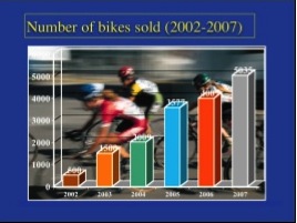
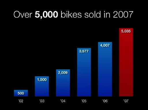
Before After
Reynolds, G. (2013). Retrieved from http://www.slideshare.net/garr/sample-slides-by-garr-reynolds
Multimedia Learning: The remaining presentation design principles draw heavily from research conducted by Richard E. Mayer. “A PowerPoint presentation is an example of multimedia, in which someone presents slides from a computer projected onto a larger screen and talks about each one (Mayer, 2001, p.2). The viewing of a multimedia presentation is consistent with the cognitive theory of learning, which assumes humans have separate information processing channels for verbal and pictorial knowledge (Mayer, 2001, p.6). Mayer outlines several principles in his work on MultiMedia Learning (Mayer & Moreno, 2003), here we briefly overview a few.
Principle #8: Contiguity Principle of Multimedia Learning
Spatial contiguity principle of multimedia learning theory states that “students learn better when corresponding words and pictures are presented near rather than far from each other on the page or screen” (Mayer, 2001, p.81). The contiguity principle also states to synchronize spoken words with corresponding graphics. This principle can also be applicable in online presentations, when the instructor records his/her narrations.
Principle #9: Segmenting Principle in Multimedia Learning
According to the segmentation principle of multimedia learning theory, learners comprehend better when the material is represented in small chunks or segments. After presentation is complete, you may consider re-examining the presentation and breaking individual slides into several segmented slides, allowing your students to proceed through the information step by step. For example, if your slide contains three points, it may be better if they appear on the screen one by one, instead of all at once.
Examples:
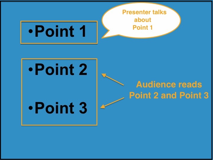
Segmenting Principle is not applied
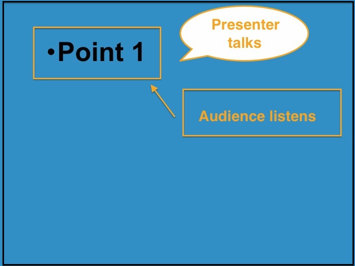
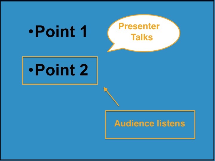
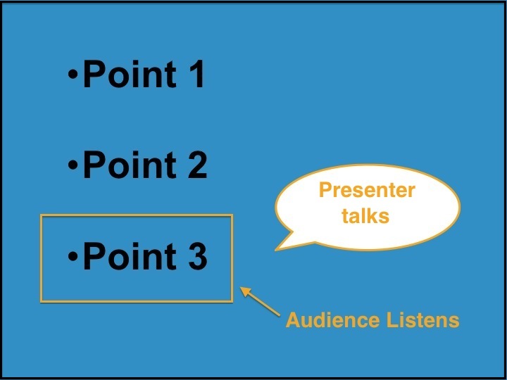
Segmenting Principle is applied
Principle #10: Modality Principle in Multimedia Learning
“Students learn better from animation (images or videos) and narration than from animation and on-screen text; that is, students learn better when words in a multimedia message are presented as a spoken text rather than printed text” (Mayer, 2001, p.134). Essentially, students can more easily understand narrated messages during a presentation when that narration happens over well designed slides with an absence of abundant text. According to Garr Reynolds the best PowerPoint slides are virtually meaningless without the narration (2010). Don’t bore your audience with bullet point after bullet point, keep a minimal amount of text on the slide. The slide should support your narration, but not include the text you are going to read during the presentation.
Contribute Your Own Design Principle: |
We recognize that creating a presentation is highly subjective, and each person will have their own unique presentation personality. Have you found an approach that has worked well for you? Let us know about it! Email your ideas to Michael Manderfeld, michael.manderfeld@mnsu.edu.
References |
Clayton, J. (2002). How to make a picture worth a thousands words. Harvard management Communication Letter, 1-5.
Kosslyn, S. M. (2011). Better PowerPoint: Quick fixes based on how your audience thinks. New York: Oxford University Press.
Mayer, R. E., & Moreno, R. (2003). Nine Ways to Reduce Cognitive Load in Multimedia Learning. Educational Psychologist,38(1), 43-52.
Mayer, R. E. (2001). Multimedia learning. Cambridge; New York: Cambridge University Press.
Pugsley, L. (2011). How to...Begin to get to grips with educational theory. Education For Primary Care, 22(4), 266-268.
Reynolds, G. (2010). Presentation zen design: Simple design principles and techniques to enhance your presentations. Berkeley, Calif.: New Riders.
Reynolds, G. (2013). Sample slides by Garr Reynolds. http://www.slideshare.net/garr/sample-slides-by-garr-reynolds
Tisdale, J. J. (2005). Effective business presentations. Upper Saddle River, N.J.: Pearson/Prentice Hall.
Weissman, J. (2011). Presentations in action: 80 memorable presentation lessons from the masters. Upper Saddle River, N.J.: FT Press.
Academic Technology Services
A Division of Information Technology Services
Memorial Library, Room 3010 • Mankato, MN 56001
Phone 507-389-6654 (V) • 800-627-3529 711 (MRS/TTY) • Fax 507-389-6115
An Affirmative Action/Equal Opportunity University.